Overview
The Toggle with label is a widget used to select between two options, either ON or OFF. It does not maintain the state itself.
Documentation

Toggle
The Toggle button have an editable Label.
Description:
The Toggle with label is a widget used to select between two options, either ON or OFF. It does not maintain the state itself.
Introduction
The Toggle widget enables toggling a Boolean attribute.
Usage
To use this widget, place it in a data container that has a Boolean attribute. The widget offers the following for configuration:
-
The Toggle button have a editable Label with default colors.
-
A Boolean attribute to toggle on user-interaction
-
An action (such as Microflow or Nanoflow) to trigger when the Switch is toggled.
-
A Style design property for brand styling, influencing the Switch’s colours
-
Common properties This widget is compatible with Atlas Core.
Features
-
Deactivate when attribute or context is read-only.
-
Add the label for ON/OFF action
-
Execute a microflow when toggled.
-
Execute a nanoflow when toggled.
-
Add a label to the switch.
-
Display in various bootstrap styles.
To use this widget, place it in the context of an object that has a Boolean attribute.
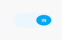
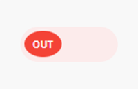
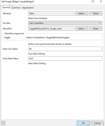
Screenshots