Overview
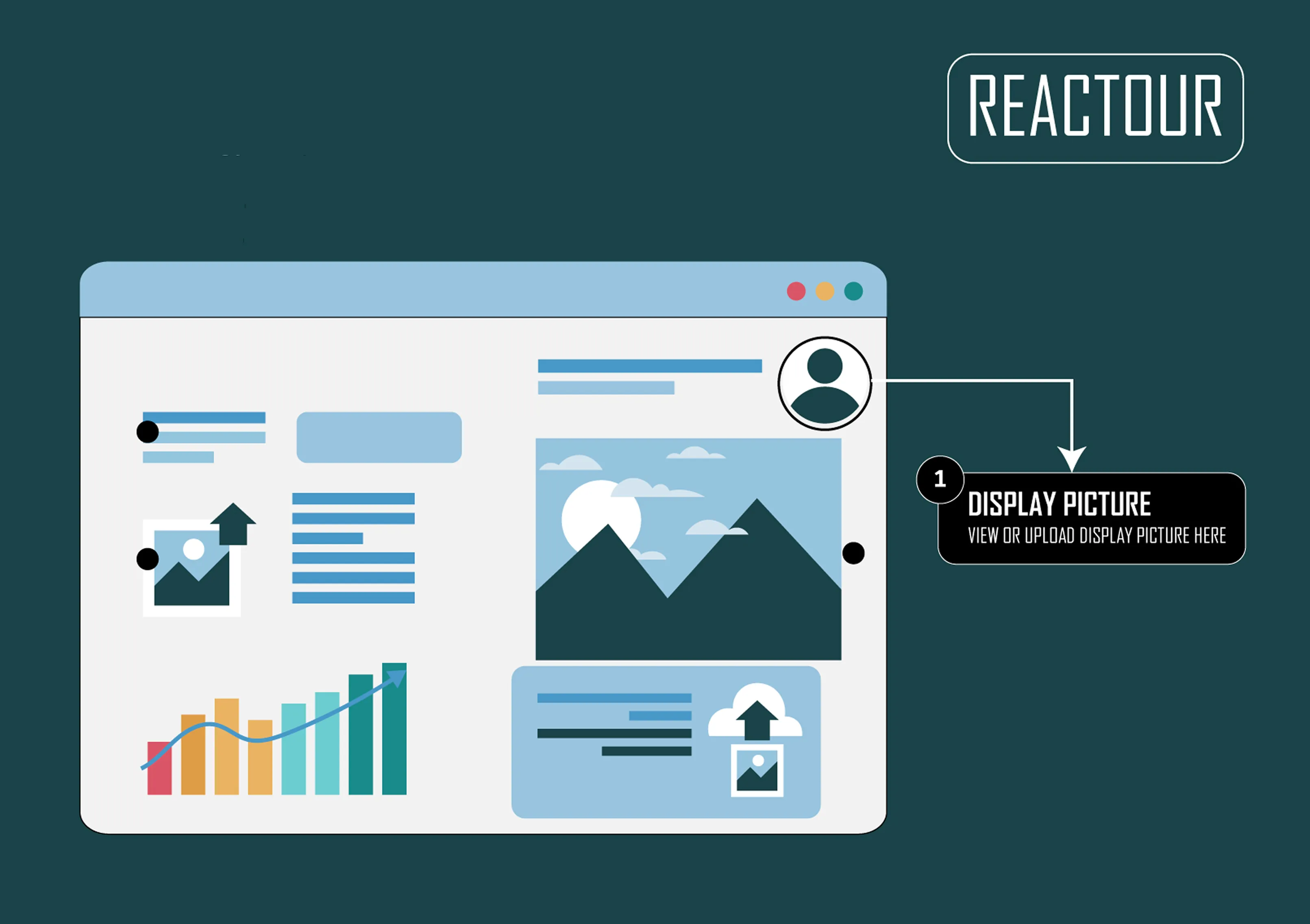
Create customizable guided tours to improve user onboarding and feature discovery, highlighting elements with dynamic tooltips and offering flexible navigation and styling options.
Dependencies:
Mendix modeler 9.12.4.
Features
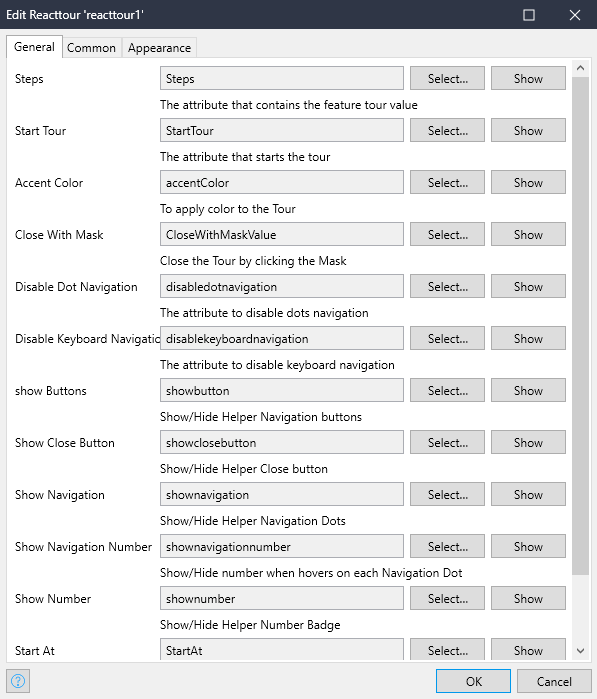
- Steps: Array of elements to highlight with special info
Example :
- '[ { "selector": ".custombutton1", "content": "This is my custom button 1.Ok, lets start with the name of the Tour that is about to begin." }, { "selector": ".custombutton2", "content": "This is my custom button 2" }, { "selector": ".custombutton3", "content": "buttons test" }]'
Selector: ClassName
Content: Content to be shown for that selector
- Start Tour: To start the Tour.
- Accent Color: Custom color for numbers and dots.
- Close With Mask: Close the Tour by clicking the Mask
- Disable Dot Navigation: The attribute to disable dots navigation
- Disable Keyboard Navigation: The attribute to disable keyboard navigation.
- Show buttons: Show/Hide Helper Navigation buttons
- Show Close button: Show/Hide Helper Close button
- Show Navigation: Show/Hide Helper Navigation Dots
- Show Navigation Number: Show/Hide number when hovers on each Navigation Dot
- Show Number: Show/Hide Helper Number Badge
- Start At: Starting step when Tour is open the first time
- Disable Focus Lock: Disable FocusLock component
Issues, suggestions and feature requests