Overview

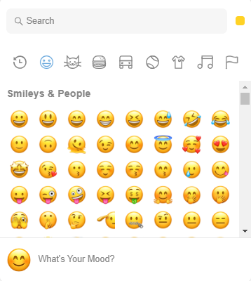
Enhance user experience by allowing users to easily insert emojis into their text.
[https://www.npmjs.com/package/emoji-picker-react](https://www.npmjs.com/package/emoji-picker-react)
Try out this sample application to check the different features.
Documentation :
Enhance user experience by allowing users to easily insert emojis into their text.
https://www.npmjs.com/package/emoji-picker-react
Emoji Display and Style
Open - Controls whether the picker is open or not. Default is true
emoji Style - Controls the emoji style. Possible values are google, apple, facebook, twitter and native. Default is apple
defaultSkinTone -Controls the default skin tone.Possible skin tones are NEUTRAL,LIGHT,MEDIUM LIGHT,MEDIUM,MEDIUM DARK,DARK . Default is NEUTRAL
lazyLoad Emojis - Controls whether the emojis are loaded lazily or not. Default is false
hiddenEmojis - Controls the emojis that are hidden from the picker.Pass an array of emoji unicode names to hide.
emoji Version -Allows displaying emojis up to a certain version for compatibility. Common values are "0.6","1.0","2.0","3.0","4.0","5.0"
auto Focus Search - Controls the auto focus of the search input. Default is true
Theme - Controls the theme of the picker. Possible values are light, dark and auto. Default is light
class Name - Adds a class name to the root element of the picker.
width - Controls the width of the picker. You can provide a number that will be treated as pixel size, or your any accepted css width as string. Default is 350
height - Controls the height of the picker. You can provide a number that will be treated as pixel size, or your any accepted css height as string. Default is 450
Skin Tone Settings
skinTones Disabled - Controls whether the skin tones are disabled or not. Default is false
skinTone Picker Location - Controls the location of the skin tone picker. Possible values are SEARCH and PREVIEW. Default is "SEARCH"
Suggested Emojis and Reactions Settings
suggested Emojis Mode - Controls the suggested emojis mode. Possible values are frequent and recent. Default is "frequent"
reactionsDefaultOpen - Controls whether the reactions picker is on the initial mount instead of the main picker component. Default is false
allowExpandReactions - Controls whether the reactions picker can be expanded to the main picker. Default is true
Search Settings
searchPlaceholder - Controls the placeholder of the search input. Default is "Search"
search Disabled - Controls whether the search is disabled or not. When disabled, the skin tone picker will be shown in the preview component. Default is false
Event Handlers
onEmojiClick -On Emoji Click
onEmojiClickedData -On Emoji Click Data
onSkinToneChange - On SkinTone Change
onSkinToneChangedData - On SkinTone Change Data
Preview Settings
Preview Config - Controls the preview of the emoji. Default is false
defaultEmoji -default Emoji. Default is "1f60a"
defaultCaption - default Caption. Default is "What's your mood?"
showPreview - showPreview. Default is true
Credentials :
demo_administrator
b7YCHluT3ouA
Dependencies:
Mendix modeler 9.12.4.
Issues, suggestions and feature requests