Overview

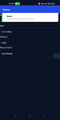
The Toast component provides a way to display temporary messages or notifications to the user.
Documentation
The Toast component provides a way to display temporary messages or notifications to the user.
Features:
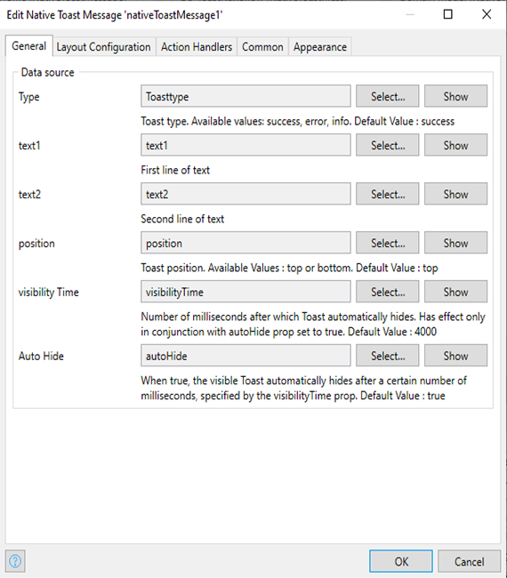
- type (string, default: 'success')
-
Specifies the type of the toast. Available values: success, error, info.
- To extend or overwrite toast types, refer to the documentation for details.
- text1 (string)
-
Sets the first line of text for the toast message.
- Click the “Directory” button and select your project folder
- text2 (string)
-
Sets the second line of text for the toast message.
- position (string, default: 'top')
-
Determines the position of the toast on the screen. Available values: top, bottom.
- visibilityTime (number, default: 4000)
-
Specifies the number of milliseconds after which the toast automatically hides.
-
This prop takes effect only when autoHide is set to true.
- autoHide (boolean, default: true)
-
When set to true, the toast will automatically hide after the specified visibilityTime milliseconds.
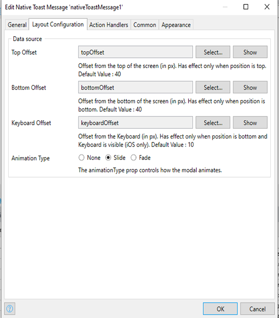
- topOffset (number, default: 40)
-
Sets the offset from the top of the screen (in pixels).
-
This prop has an effect only when the position is set to top.
- bottomOffset (number, default: 40)
-
Sets the offset from the bottom of the screen (in pixels).
-
This prop has an effect only when the position is set to bottom.
- keyboardOffset (number, default: 10)
-
Sets the offset from the keyboard (in pixels). This prop is only applicable when the position is set to bottom, and the keyboard is visible (iOS only).
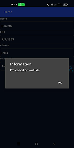
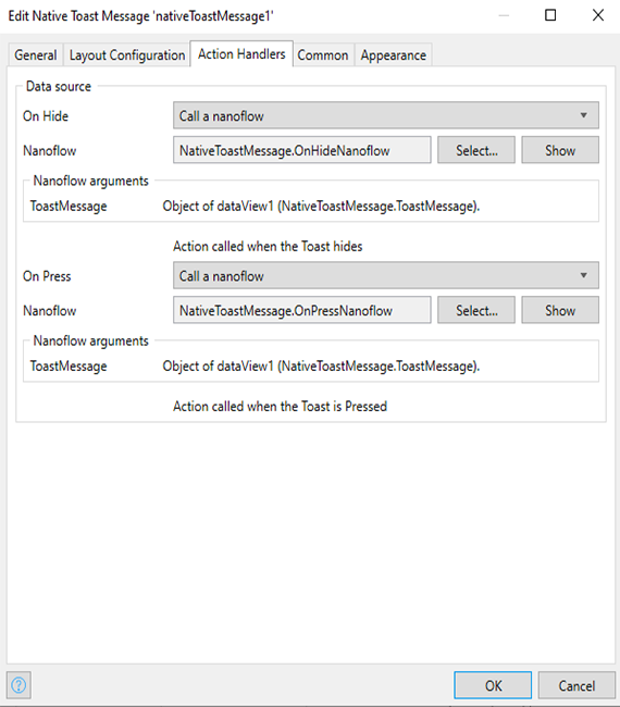
- onHide (() => void)
-
A callback function that is called when the toast hides.
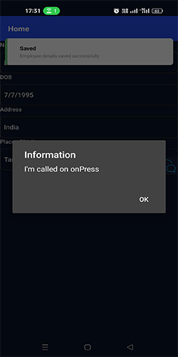
- onPress (() => void)
-
A callback function that is called when the toast is pressed.
Issues, suggestions and feature requests
Screenshots