Overview
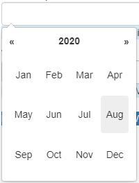
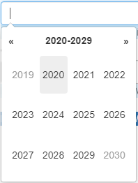
Month and year picker provides a flexible month picker widget in the Bootstrap style.
Documentation

Description
Feature rich datepicker based on
https://bootstrap-datepicker.readthedocs.io/en/latest/index.html
Demo URL https://mydemoversion8-sandbox.mxapps.io/p/datepickers.
Typical usage scenario
Date picker is cases where more options are required.
Features and limitations
-
Optionally starts when entering the field, typing a date is also possible
-
Optionally inline (always show calendar)
-
First day of the week option
-
Show week number option
-
Option to make days of the week not selectable
-
Version for a date range to enter two dates
-
Optional autoclose
-
Optional highlight today
-
Add a time (default 12:00) to the date
-
Limit the date relative to current date. e.g. +/- 3 months.
-
English, German, French and Dutch languages.
-
Optional startview to start on year or month level